Colors have great importance in our lives. To express our feelings, we use colors as a sign. Moreover, these colors have a great impact on our mood and feeling. We use to wear and prefer colors as per our mood. Sometimes to beat a specific feeling or mood, colors help us a lot. On the other hand, to demonstrate a number of situations and signs, colors are the best source.
Just like our daily life, in the film production colors have a great impact and role. In a scene or set composition, the director and DOP, along with the set designer, have to consider the colors at large. As a supportive factor, it helps to explain a scene to the audience. For the film screen technicians, it is necessary to focus on the colors and their composition on screen.
More on CINEMAPALETTES
Mode of use
Colors are used in film production on two stages, firstly for the set designing or scene-setting and secondly in color grading. Both uses are already decided in the preproduction, but the first implementation is in production, and the second is in post-production.
When designing the film set, the set designer makes sure to incorporate the appropriate colors that will help to boost the scene feel. If there is romance, then there will be white with any of the dark but bright colors. It creates a feeling of romance, no matter if it is happening indoors or outdoor. For the action sequence, there should be brown or dust colors. The mud or dust is the sign of action and promotes the feel.
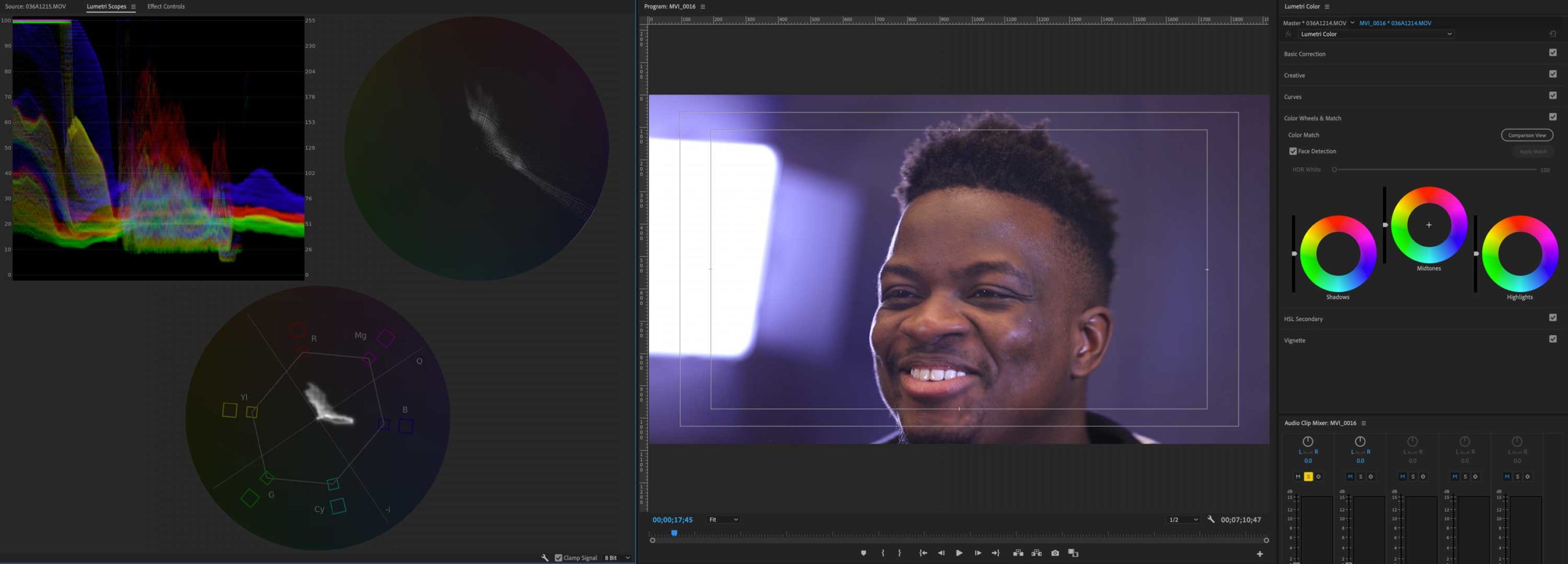
While on the other hand, when it comes to color grading, the postproduction unit considers the specific color grades for a specific scene. Not all the recordings are used in their original format. In fact, every scene and film is designated with a specific pattern of color grading.
More meaningful shots
The color psychology helps to ensure that your scenes and shots are more meaningful. The best thing about using colors is you can prepare the viewer’s subconscious for an expected action. It will not leave the view out of the loop and let them relate to what is happing on the screen. If you are unable to connect the viewer with the scene using color or music, then there will be no feeling in the film. It is the best tool filmmakers use to influence and attach the viewer with the scene or film.
Immense impact
There is no doubt that the colors in your room, and you are wearing have a great impact on your personality, mood, and understanding. Therefore, the screen colors do have a great impact on the viewers. It lets them have more involvement and focus on what is going on.
Unique screen feel
By using some different and effective color options, you will be able to create a unique screen feel. Filmmaking is 50 percent of the story, dialogue, production, and rest of 50 percent are about creating audience interest. Even if you have a number of amazing characters, played by some known actors with the best of the crew, but if there are no colors, then you cannot have a good response. Even in the era of black and white cinema, there were shades of grey on the screen to help story and film in getting attention.
These days, there are more options for colors and their uses, so you can actually have the best use of these colors. Make sure that you are going to have on set colors in relevance to the color grading for the scene.
How directors use color psychology?
There is a big question about directors on using the colors of psychology in the filmmaking. Whenever a director is going through any script, he focuses on screenplay along with the story and dialogues. In the screenplay, he decides to pick up the best color combination for the scene. The visualization brings some of the amazing combinations to the director at times. Lately, he can take help from the wardrobe manager and set designer along with the DOP to create that feel on screen.
Danielle Feinberg, director of photography at Pixar, describes herself as “color obsessed” (TED Talk: The magic ingredient that brings Pixar films to life). “I think about it nonstop,” she said. “Lighting and color are part of the backbone of emotion.” She points to the scene in The Incredibles (2004) where Mr. Incredible works at his desk at Insuracare — the colors are dulled and gray to communicate a sense of depression. In Toy Story 3 (2010), a yellowish-green around the character Lots-o’-Huggin’ Bear foreshadows that maybe this isn’t the sweet, lovable bear you thought. For each film, Pixar creates a “color script” that maps out the hues for all scenes so they fit within the larger story arc. The goal: to make key moments feel appropriately vibrant or somber. Feinberg looks at the opening of WALL-E (2008): “We had to do massive visual storytelling because there’s no dialogue — only robot boops and beeps. Yet, we needed the audience to understand that we’re on Earth, that it’s polluted, and that WALL-E’s the last one left. So we limited the palette to tans and oranges,” she said. “Our production designer was adamant that there be no green anywhere, because he wanted a visual punch when WALL-E finds a plant for the first time.” Color amplifies this important moment. “Your eyes have been washed in a limited palette and suddenly there’s intense green,” said Feinberg. “It cerebrally makes a difference.”
Is there a relation between color and genre?
The genre of the film and the use of colors are very close to each other. We have some predefined colors for specific conditions and situations. In the case of love, passion, violence, anger, and danger, we have a red color to use. If there is a horror genre film, then there will be dark colors like black and green in a combination of sound effects. It will create something relatable to horror in your mind.
Using a pink color in a horror sequence will not get you that much impact. This is because your mind is not subject to relate pink color with danger, horror, or violence. Same as using the orange color to display feminist can be a failure. Any movie with a feminist genre should have shades of pink in combination with white or peach.
Some colors and their meanings
Red – there is no doubt that red is the color of passion, love, danger, anger, power, violence, dominance, so it is used in the films likewise.
Pink – it belongs to the red family but a little opposite, it belongs to beauty, feminism, playful, empathy, sweetness and innocence
Orange – it refers to happiness, youth, exotic, friendly, sociality, warmth
Yellow – another danger color that leads to sickness, naïve, obsessive, insecurity, madness, idyllic
Green – it depicts nature, immaturity, danger, darkness, ominous, corruption and some shady things
Blue – it is cold that refers to isolation, melancholy, cerebral, calm and passivity
Purple – Display fantasy, mystical, ominous, illusory, eroticism
Conclusion
The use of colors in filmmaking is essential and helps the directors to enhance the presentation. No color coordination with scene nature or poor coordination can result in a product failure or disaster. The play with the psychology of colors, it is necessary to consider colors from the beginning of production.